Pantone Color of the Year 2024: Wrap Your Lake Home in Elegant Warmth with Peach Fuzz!

Photo courtesy of Pantone

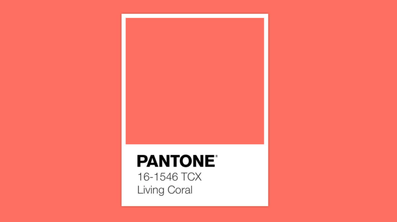
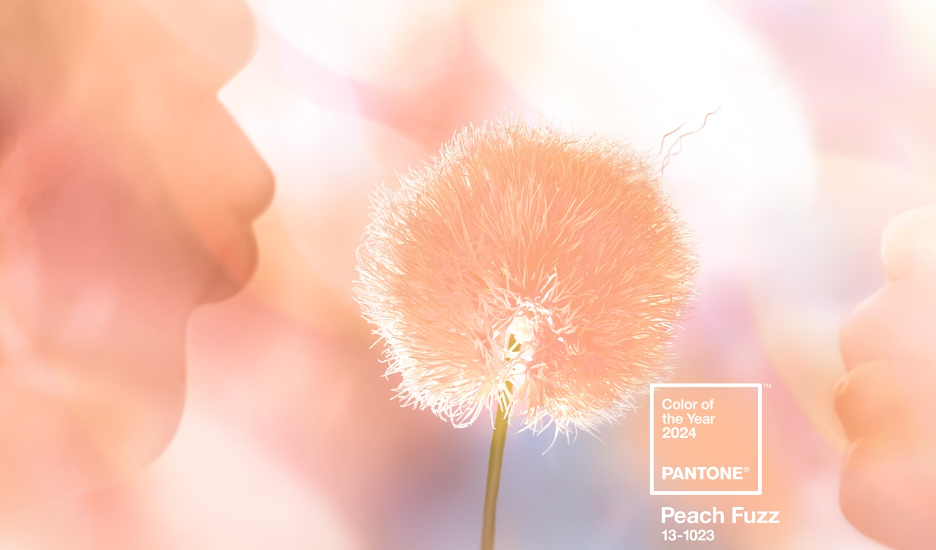
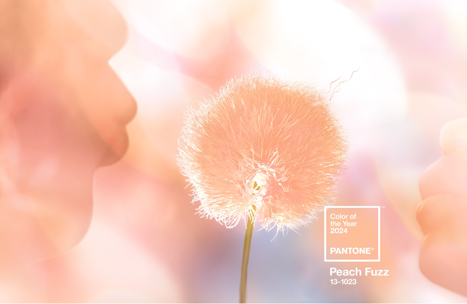
Released in December 2023, Pantone’s Color of the Year 2024 13-1023 Peach Fuzz “captures our desire to nurture ourselves and others,” say the color experts at the renowned Pantone Color Institute.  

“It’s a velvety, gentle peach tone whose all-embracing spirit enriches mind, body, and soul,” says Leatrice Eiseman, Pantone Color Institute’s Executive Director. “In seeking a hue that echoes our innate yearning for closeness and connection, we chose a color radiant with warmth and modern elegance. A shade that resonates with compassion, offers a tactile embrace, and effortlessly bridges the youthful with the timeless.”

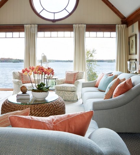
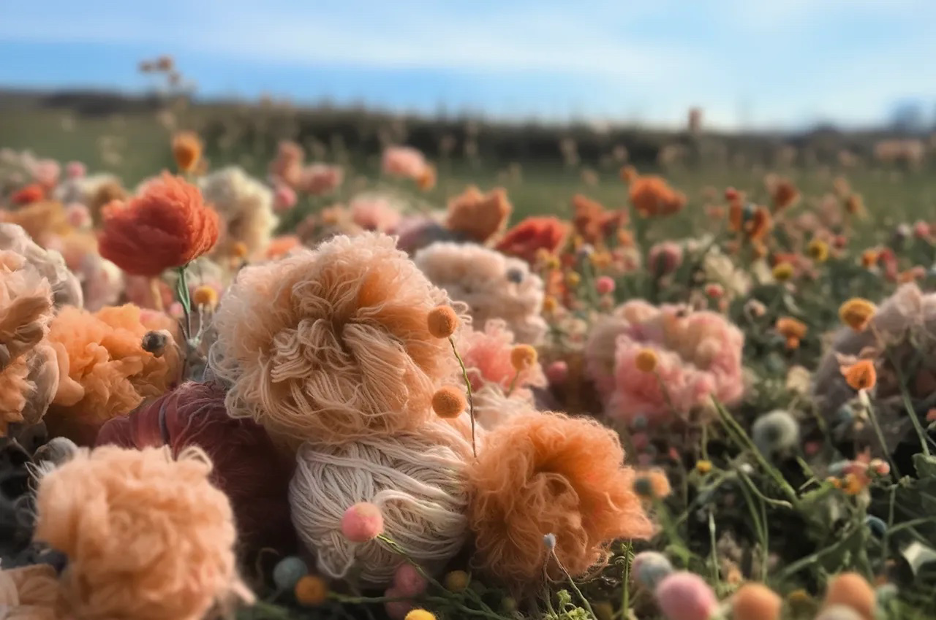
Both subtle and sensual, this soft peach hue communicates a feeling of kindness and nurturing—a warm message of community, collaboration, sharing, and caring. So, how do we introduce this inviting color into our lake homes? Here are some inspiring ideas that will guide you in creating a warm and fuzzy sanctuary all your own—whether you want to make a WOW statement or introduce soft touches throughout your rooms.  

Palette Play

Pantone Color of the Year 2024 Palettes
Photo courtesy of Pantone

“With this year’s Pantone Color of the Year 2024, we see an increased focus on community and people across the world reframing how they want to live and evaluating what is important—that being the comfort of being close to those we love,” says Laurie Pressman, Vice President of the Pantone Color Institute. “The color is one whose warm and welcoming embrace conveys a message of compassion and whose cozy sensibility brings people together and enriches the soul.”

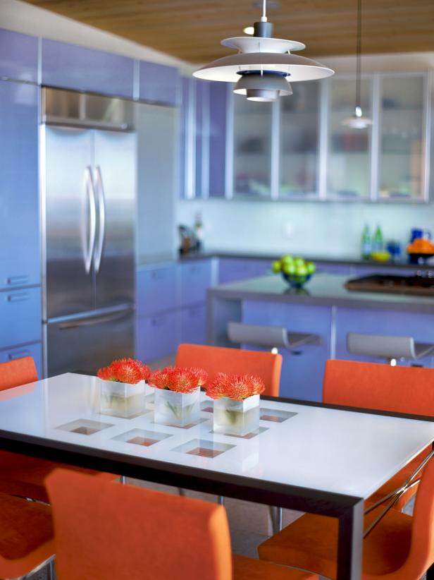
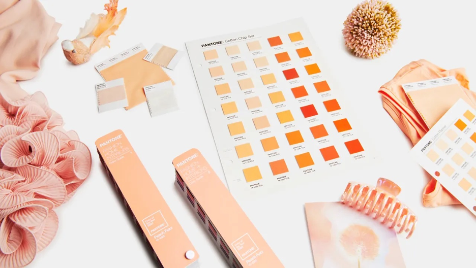
Comforting and approachable, PANTONE 13-1023 Peach Fuzz harmonizes beautifully with a wide range of color tones. Mix it with barely-there beiges and whisper-soft peachy pinks to evoke a warm and inviting ambiance. Or create a cheerful high contrast with bright orange, blue-greens, and vibrant, deep pinks. For playful inspiration, check out these Pantone Color of the Year Palettes featuring Libations, Flavor-Full, Hybrid Hues, Peach Plethora, and Pairings.

“A cozy peach hue softly nestled between pink and orange, PANTONE 13-1023 Peach Fuzz brings belonging, inspires recalibration, and an opportunity for nurturing,” Eiseman adds, “conjuring up an air of calm, offering us a space to be, feel, and heal and to flourish from whether spending time with others or taking the time to enjoy a moment by ourselves,”

So, whether you opt to decorate expressively or quietly, the choice is yours to select the palette that embodies your taste and lifestyle. If you don’t want to commit long-term, experiment with pillows, throws, artwork, lamps, rugs, and tableware.

Dreamsicle Décor

Pantone Peach Fuzz Pop Divide Rug from Ruggable.
Photo courtesy of Ruggable

Enliven a seating area of your lake home with this limited-edition Pantone Peach Fuzz Pop Divide Rug from Ruggable. Featuring Pantone’s Color of the Year 2024 and inspired by Bauhaus architecture, this asymmetrical geometric composition blends dreamy pops of Pantone Peach Fuzz, Pantone Peach Purée, Pantone Peach Pink, orange, and cream for a vibrant statement in any space. This machine-washable rug is water- and stain-resistant and is available in various sizes and flatwoven or tufted textures. Its minimalistic modern-retro style works with endless décor styles and creates an eye-catching accent piece for your home. Offering a comforting set of three rugs, a doormat, and a bath mat, The Ruggable x Pantone Collection “harnesses Peach Fuzz’s cheerfulness to transcend seasons and inspire well-being in homes all year round,” say the Pantone color experts.  

Peachy Prints

Spoonflower's partnership with Pantone for the Color of the Year 2024, exclusive launch collection of fabrics, wallpapers
Photo courtesy of Spoonflower via Pantone

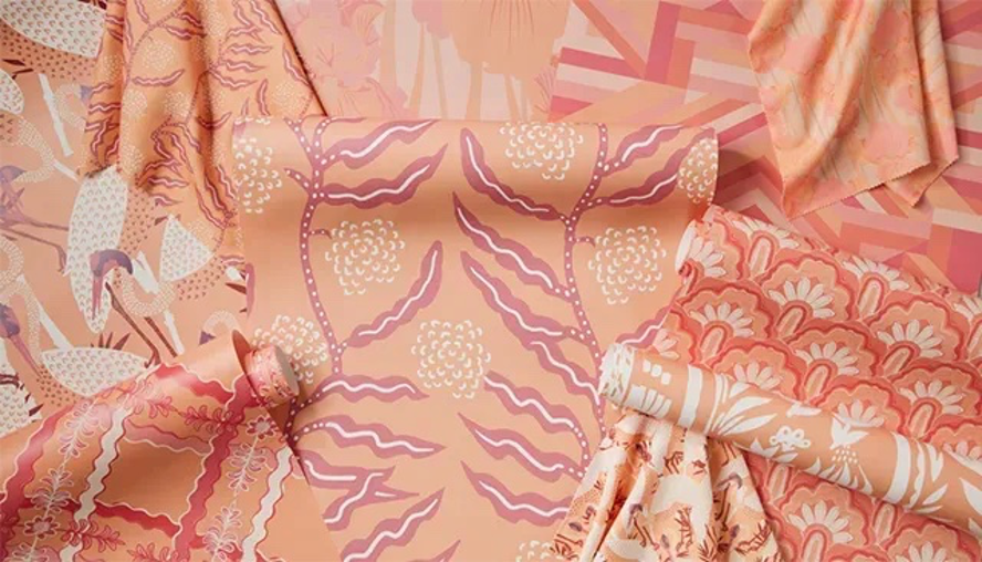
Bring a sense of warmth and serenity to spaces throughout your home with this exclusive launch collection of fabrics, wallpapers, bedding, and dining/living room décor from Spoonflower in collaboration with Pantone. Spoonflower’s partnership with Pantone for the Color of the Year 2024 “brings together the authority in color and the authority in surface pattern design,” say the Pantone color experts. “Three distinguished Spoonflower independent artists have already unveiled new designs for print-on-demand wallpaper, fabric, and home décor, and the creativity continues in January with Spoonflower’s 2024 Pantone Color of the Year Design Challenge.”

With everything from floral and modernist-inspired wallcoverings to throw blankets, curtains, and cocktail napkins, The Spoonflower x Pantone Collection celebrates PANTONE 13-1023 Peach Fuzz in impeccable style.

Warm & Fuzzy

PANTONE 13-1023 Peach Fuzz hotel lobby design
Photo courtesy Pantone

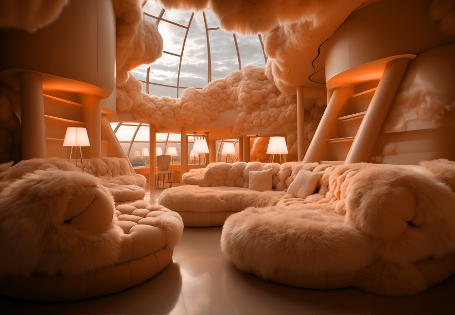
“Drawing comfort from PANTONE 13-1023 Peach Fuzz, we can find peace from within, impacting our well-being,” notes Eiseman. “An idea as much as a feeling, PANTONE 13-1023 Peach Fuzz awakens our senses to the comforting presence of tactility and cocooned warmth.”  

This dreamy hotel lobby design says it all. Enveloped in textures embodying the Peach Fuzz philosophy and aesthetic, this nurturing, fantasy-like space portrays a warm embrace. Who wouldn’t want to sink right in?

Nourish & Flourish

PANTONE 13-1023 Peach Fuzz inspirational field of flowers with textiles
Photo courtesy of Pantone

“Sensitive but sweet and airy, PANTONE 13-1023 Peach Fuzz evokes a new modernity,” say the Pantone experts. “While centered in the human experience of enriching and nurturing the mind, body, and soul, it is also a quietly sophisticated and contemporary peach with depth whose gentle lightness is understated but impactful, bringing beauty to the digital world. Poetic and romantic, a clean peach tone with a vintage vibe, PANTONE 13-1023 Peach Fuzz reflects the past yet has been refashioned with a contemporary ambiance.”

As you seek out the cozy moments at your lake home this year, let PANTONE 13-1023 Peach Fuzz inspire you and “enkindle warmth from the outside in.” From all of us at Lake Homes—may your 2024 reveal a refreshingly peaceful sense of renewal.

Pantone Color of the Year 2023: Energize Your Lake Home with Viva Magenta!

Hero image for Pantone Color of the Year 2023, 18-1750 Viva Magenta
Photo courtesy of Huge, Inc. for Pantone

Released in early December 2022, Pantone’s Color of the Year 2023, 18-1750 Viva Magenta, “is brave and fearless, a pulsating color whose exuberance promotes optimism and joy,” say the color experts at the renowned Pantone Color Institute.  

“As virtual worlds become a more prominent part of our daily lives, we look to draw inspiration from nature and what is real,” said Leatrice Eiseman, Executive Director of the Pantone Color Institute. “PANTONE 18-1750 Viva Magenta descends from the red family and is inspired by the red of cochineal, one of the most precious dyes belonging to the natural dye family as well as one of the strongest and brightest the world has known. Rooted in the primordial, PANTONE 18-1750 Viva Magenta reconnects us to original matter. Invoking the forces of nature, it galvanizes our spirit, helping us to build our inner strength.”

Delightfully rebellious, this electrifying and empowering red encourages unrestrained self-expression and experimentation. So, how do we introduce this animated color to our lake homes? The choice is yours. Make a stand-out statement or apply small splashes throughout your rooms. Here are some inspiring ideas that just may tempt you to color outside the lines of your comfort zone.

Palette Possibilities

Pantone fashion, home, and interiors color palettes for Pantone's Color of the Year 2023, 18-1750 Viva Magenta, fabric swatches, scarf, bag
Photo courtesy of Pantone

“The last few years were transformative in many ways in terms of people’s sense of self and the way well-being, priorities, and identity are being thought about,” said Laurie Pressman, Vice President of the Pantone Color Institute. “As a result, space has been created where we are free to explore and be accepted for exactly who we feel we are, whether it be in a cybernetic universe, a conventional space, or a magical blend of both. We are creating a dynamic world that encourages experimentation, one that leverages the virtual within the physical realm and emboldens our strength and spirit to explore groundbreaking possibilities.”

Witty and versatile, PANTONE 18-1750 Viva Magenta integrates beautifully with a wide range of color tones. Mix it with basics like calming grays, rich browns, and soothing maroons, or create dynamic contrast with bright orange and deeper shades of magenta. Pale pink, blushing rose, and coral hues also pair well and generate a well-balanced palette with coordinating undertones. “A nuanced crimson red tone that presents a balance between warm and cool, PANTONE 18-1750 Viva Magenta is also a hybrid color, one that comfortably straddles the physical and virtual, evocative of our multi-dimensional world,” say the Pantone color experts.

So, whether you opt to decorate daringly or keep it subtle, the choice is yours to select the palette that embodies your taste and lifestyle. If you don’t want a long-time commitment, play it safe—yet sassy. Accessorize with pillows, throws, artwork, lamps, rugs, or tableware.

Wall Power

Pantone's color of the year 2023, Viva Magenta mural wallpaper design from Hovia
Photo courtesy of Hovia

Create an electrifying accent wall with this sleek Viva Magenta mural wallpaper design from Hovia. Inspired by Pantone’s Color of the Year 2023, the wallpaper prominently features PANTONE 18-1750 Viva Magenta mixed with geometric circles in gradient hues of lavender, orange, and varying shades of magenta. Apply this mural anywhere to create a wow factor, including your hallway, home office, living area, or dining room.  

Accent Art

This Must Be The Place Neon sign print from Desenio, accent art with  Pantone Color of the Year 2023, 18-1750 Viva Magenta
Photo courtesy of These Three Rooms

For an instant accent piece, apply a pop of Pantone’s Color of the Year 2023 with artwork. Combine this powerful magenta print from Desenio with almost any palette for an impactful focal point. Here, it amps up an all-white color scheme to create dynamic visual interest.

Power Color

Red sofa grouping from Big Furniture Group representing furnishings with Pantone Color of the Year 2022, 18-1750 Viva Magenta
Photo courtesy of Big Furniture Group

If you’re the adventurous type, go bold. Empower your rooms with vibrant furniture pieces saturated in this rich, red-based hue. Then, apply neutral accents with pillows, rugs, and accessories to balance the color so it doesn’t overwhelm the space. If you don’t want to commit fully, try using one piece of furniture as an eye-catching accent piece.

Colorful Cocoon

Reading nook wall under a staircase with  Pantone Color of the Year 2022,  18-1750 Viva Magenta and turmeric sofa from Snug
Photo courtesy These Three Rooms

Create a quaint little reading nook in your lake home with Pantone’s Color of the Year 2023. Here, PANTONE 18-1750 Viva Magenta wraps the space in a cozy cocoon under the staircase. An unforgettable turmeric-hued sofa from Snug turns up the heat to generate even more warmth. Who wouldn’t want to while away an afternoon in this inviting space?

Imagine “Magentaverse”

Pantone's Color of the Year, 2023 color palette and products, coffee mug, notebook, pen
Photo courtesy of Pantone

 “To embody the spirit of PANTONE 18-1750 Viva Magenta, we embarked on a new approach of collective creative collaboration,” said Pressman. “Leveraging the power of technology and Pantone’s expertise in color to curate a new interpretation of the Pantone Color of the Year 2023, we created the Magentaverse, an unexpected and exciting color universe we look forward to sharing with the world to experience as well.”

So, step into the imaginative Magentaverse and have fun infusing this upbeat hue into your lake home spaces. The possibilities are endless, with a limitless array of palette combinations. From all of us at Lake Homes Lifestyles—may your 2023 reveal an adventurous and colorful journey!

2022 Pantone Color of the Year: Harmonize Your Lake Home with Very Peri

Photo courtesy of Huge, Inc. for Pantone

Released in early December 2021, Pantone’s highly anticipated Color of the Year 2022, Very Peri, “is a symbol of the global zeitgeist of the moment and the transition we are going through,” say the experts at the esteemed Pantone Color Institute.  

“As we move into a world of unprecedented change, the selection of PANTONE 17-3938 Very Peri brings a novel perspective and vision of the trusted and beloved blue color family, encompassing the qualities of the blues,” says Leatrice Eiseman, Executive Director of the Pantone Color Institute. “Yet at the same time with its violet-red undertone, PANTONE 17-3938 Very Peri displays a spritely, joyous attitude and dynamic presence that encourages courageous creativity and imaginative expressions.”

Impossible to ignore, this captivating blue hue most certainly captures our attention as well as our creative spirit. So, how do we introduce this curious color to our lake homes? Whether you want to make a big splash, or apply little pops of color throughout your rooms, here are some ideas to inspire you—and perhaps tempt you to break out your creative paintbrush.   

Palette Play

Photo courtesy of Pantone

To help you use this wonderful new shade in your home, Pantone has created four unique color palettes intended to work in harmony with Very Peri. “Each palette conveys a different mood, illustrating PANTONE 17-3938 Very Peri’s versatility,” say the color experts. “Each palette additionally features three suggested color combinations integrating PANTONE 17-3938 Very Peri.”

Choose from the subtle tones of Balancing Act, the nature-infused greens of Wellspring, the classic neutrals of The Star of the Show, or the whimsical color bursts of Amusements when designing the perfect palette to reflect your personal taste.

“The Pantone Color of the Year reflects what is taking place in our global culture, expressing what people are looking for that color can hope to answer,” says Laurie Pressman, Vice President of the Pantone Color Institute. “Creating a new color for the first time in the history of our Pantone Color of the Year educational color program reflects the global innovation and transformation taking place. As society continues to recognize color as a critical form of communication and a way to express and affect ideas and emotions and engage and connect, the complexity of this new red violet-infused blue hue highlights the expansive possibilities that lay before us,” she notes.

Artful Accents

Photo courtesy of House & Home

Want just a splash of Very Peri without committing to an entire room? Instead, paint an accent wall that will instantly liven up your space and truly immerse you in this vibrant hue. Amplifying just one wall is an ideal way to add color to your room without going too bold. In addition, your decorative furnishings—artwork, lighting, furniture, and collections—will suddenly pop if you use contrasting or complementary colors like white, black, neutrals, and varying shades of blue.

Kitchen Charisma

Photo courtesy of Shelley Metcalf via HGTV

Combine this powerful periwinkle hue with bright orange for a dazzling and unexpected WOW factor in the kitchen. Here, streamlined cabinetry, contemporary furnishings, and sleek accents lend themselves to this ultra-modern aesthetic.  

Bathroom Beauty

Photo courtesy of David A. Land via HGTV

Freshen up your lake house bathroom with this pretty periwinkle shade. Combine with visually impactful embellishments like a patterned shower curtain and some new towels in a vibrant complementary color—try citrine or spring green—to give your bathroom a dose of cottage charm.

Off the Wall

Photo courtesy of Sarah Dorio via HGTV

Use this irresistible periwinkle tone as your foundation shade for a layering of sophisticated blue hues. But this time, take it all the way to the ceiling, wrapping your entire room in this soothing and mesmerizing color. Here, the harmonious mix of blues works to unify the space and blend the whimsical fusion of design styles.

Bold & Beautiful

Photo courtesy of Pantone

 “Displaying a carefree confidence and a daring curiosity that animates our creative spirit, inquisitive and intriguing PANTONE 17-3938 Very Peri helps us to embrace this altered landscape of possibilities, opening us up to a new vision as we rewrite our lives,” say the Pantone color experts. “Rekindling gratitude for some of the qualities that blue represents complemented by a new perspective that resonates today, PANTONE 17-3938 Very Peri places the future ahead in a new light.”

So, start dreaming now and infuse a bit of this delicious hue into your lake home spaces. The palette possibilities are virtually limitless, with an endless array of color combinations. From all of us at Lake Homes Lifestyles—may your 2022 be filled with joyful color!

Life in Living Coral: Using the 2019 Color of the Year in Your Home

Pantone Color of the Year 2019 Living Coral

Pantone hit it out of the ballpark with their 2019 Color of the Year, Living Coral. This vibrant, brilliant hue is a dreamy complement to all things nautical and shore-side.

Here are five tips for using the Pantone Color of the Year in your lake home.

Textile Touches

Living Coral Furniture Decor Lake Front Home
Photo courtesy of ComfyDwelling.

The beauty of textiles is they allow you to make bold or subtle statements with color.

For a low-key look, why not stock your bathrooms with some sumptuous coral-toned bath towels?

Some luxury throw pillows in coral will brighten up your living room, and at the very least some coral placemats or napkins can spice up the dining room table.

Be careful with bright draperies though–your view is one of the most precious things your lake home has to offer, and bright drapes can pull the eye away from it!

Accent Walls

Adding an accent wall in coral is one way to celebrate this color loudly.

While some homeowners may say, “Go big or go home,” with a color this boisterous, prevailing wisdom holds that less is indeed more.

Perfect for warming up any space, Living Coral speaks to us most when used as an accent in a breakfast nook, bathroom, or mudroom.

Statement Pieces

Adirondack Chairs in Living Color
Photo courtesy of Fifthroom.

For a bold furnishing set for those with no fear of commitment, these Adirondack chairs in coral will give your outdoor lounging area a delicious burst of color.

Some retro appliances in Living Coral can also brighten up a kitchen dramatically. A classic coral bedspread will give you or your guests an exciting feature to sleep on for years to come.

Wall Art

Consider a piece of art featuring the pigment. An abstract painting or a vintage print can give you just the right amount of coral flair you need to feel like your home is on-point with this trend.

Sometimes, a tiny amount of color will tie a room together in a sophisticated way. Wall art featuring some coral accents will really shine when incorporated with some textile touches nearby.

Floral Accents

Maybe you find the idea of committing to Living Coral long-term a little daunting. If so, consider adding some living touches to your living space.

A few stems of amaryllis, coral roses, and tuberose look great in a vase and can add just a touch of the color to the room on a short term basis.

There are also many beautiful orchids whose coral blooms are great for warming up your home’s interior.

Outdoor flower gardens are becoming more trendy as homeowners to improve curb appeal and increase the value of their homes and vacation houses.

Creating a garden can do just that and will give you a lovely outdoor hobby, as garden maintenance is a must for thriving blooms.

Try planting a Coral Wings Rhododendron or a Knockout Rose in Coral. These gorgeous bloomers will add some seasonal flair to your yard and can even provide some stems for indoor bud vases.

Whether you’re a slave to trends and can’t wait to paint the lake house coral, or you prefer to keep things more subtle, these five tips for using the Pantone color of the year in your lake home will freshen up your 2019 look with very little work.

For more home improvement or DIY tips, read more articles here.

Article Contributed by: Sarah Miller, Lawnstarter.com

Sarah Miller is a writer, self-claimed nutritionist, and CrossFit junkie. She spends most of her time meal prepping and actively trying to beat personal records in the gym, but always enjoys a meditative walk through a nearby woodland area or near a lake.