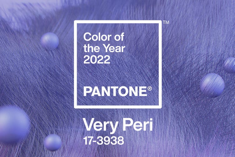
Released in early December 2021, Pantone’s highly anticipated Color of the Year 2022, Very Peri, “is a symbol of the global zeitgeist of the moment and the transition we are going through,” say the experts at the esteemed Pantone Color Institute.
“As we move into a world of unprecedented change, the selection of PANTONE 17-3938 Very Peri brings a novel perspective and vision of the trusted and beloved blue color family, encompassing the qualities of the blues,” says Leatrice Eiseman, Executive Director of the Pantone Color Institute. “Yet at the same time with its violet-red undertone, PANTONE 17-3938 Very Peri displays a spritely, joyous attitude and dynamic presence that encourages courageous creativity and imaginative expressions.”
Impossible to ignore, this captivating blue hue most certainly captures our attention as well as our creative spirit. So, how do we introduce this curious color to our lake homes? Whether you want to make a big splash, or apply little pops of color throughout your rooms, here are some ideas to inspire you—and perhaps tempt you to break out your creative paintbrush.
Palette Play
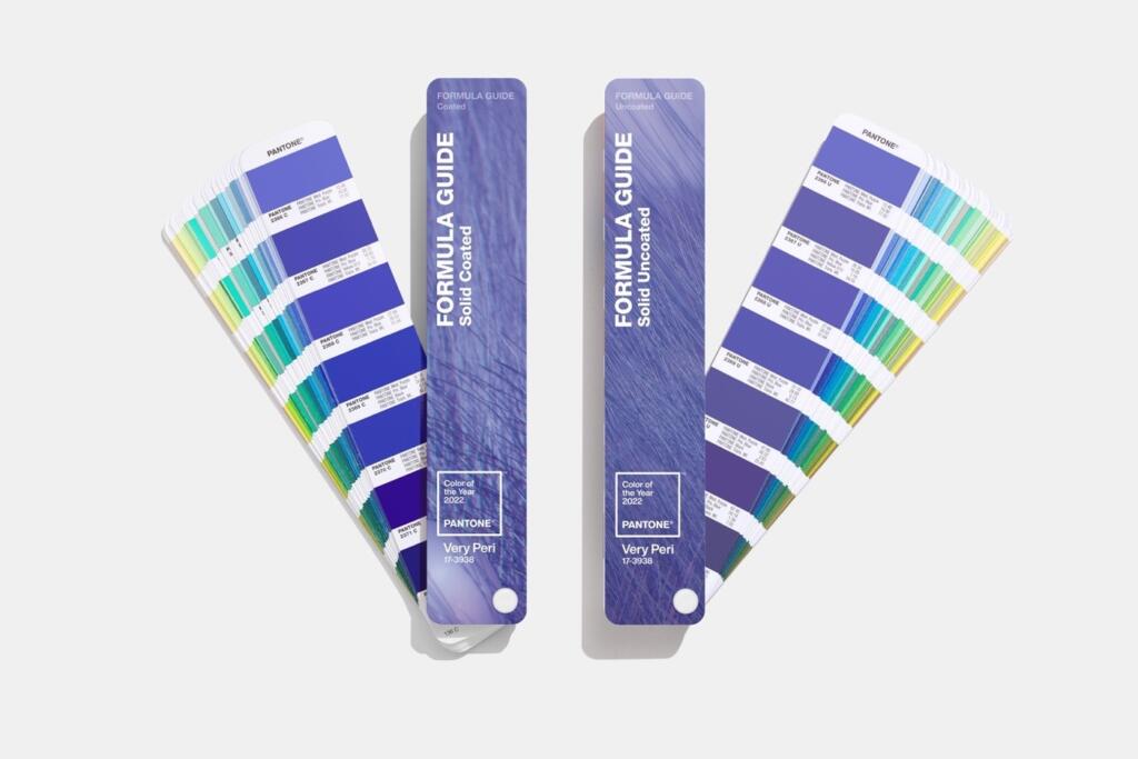
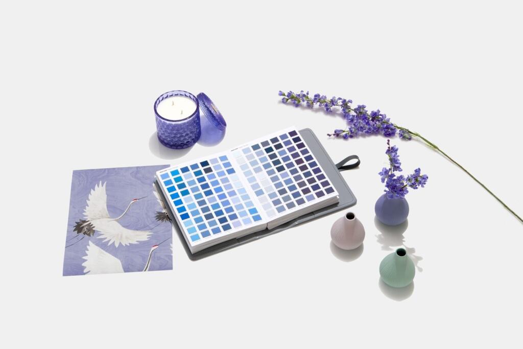
To help you use this wonderful new shade in your home, Pantone has created four unique color palettes intended to work in harmony with Very Peri. “Each palette conveys a different mood, illustrating PANTONE 17-3938 Very Peri’s versatility,” say the color experts. “Each palette additionally features three suggested color combinations integrating PANTONE 17-3938 Very Peri.”
Choose from the subtle tones of Balancing Act, the nature-infused greens of Wellspring, the classic neutrals of The Star of the Show, or the whimsical color bursts of Amusements when designing the perfect palette to reflect your personal taste.
“The Pantone Color of the Year reflects what is taking place in our global culture, expressing what people are looking for that color can hope to answer,” says Laurie Pressman, Vice President of the Pantone Color Institute. “Creating a new color for the first time in the history of our Pantone Color of the Year educational color program reflects the global innovation and transformation taking place. As society continues to recognize color as a critical form of communication and a way to express and affect ideas and emotions and engage and connect, the complexity of this new red violet-infused blue hue highlights the expansive possibilities that lay before us,” she notes.
Artful Accents
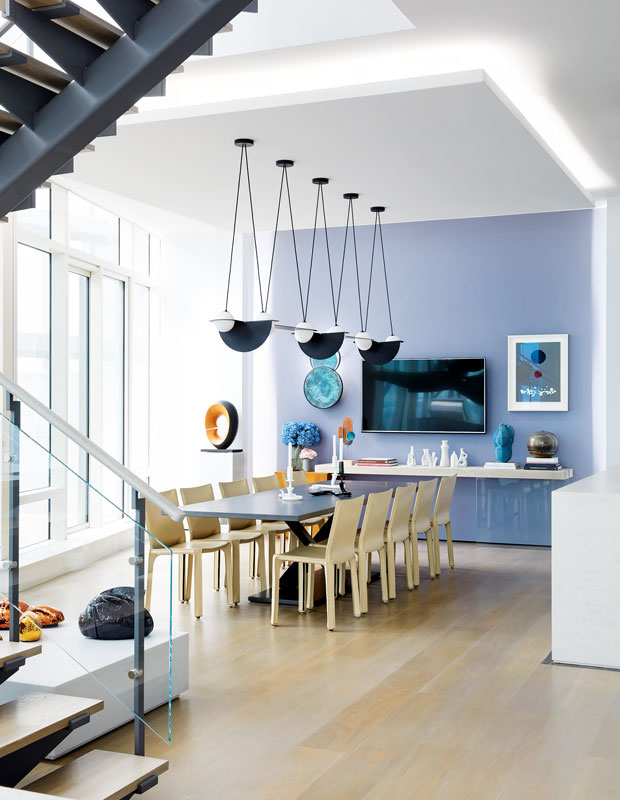
Want just a splash of Very Peri without committing to an entire room? Instead, paint an accent wall that will instantly liven up your space and truly immerse you in this vibrant hue. Amplifying just one wall is an ideal way to add color to your room without going too bold. In addition, your decorative furnishings—artwork, lighting, furniture, and collections—will suddenly pop if you use contrasting or complementary colors like white, black, neutrals, and varying shades of blue.
Kitchen Charisma
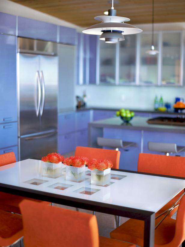
Combine this powerful periwinkle hue with bright orange for a dazzling and unexpected WOW factor in the kitchen. Here, streamlined cabinetry, contemporary furnishings, and sleek accents lend themselves to this ultra-modern aesthetic.
Bathroom Beauty
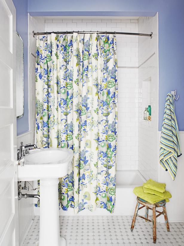
Freshen up your lake house bathroom with this pretty periwinkle shade. Combine with visually impactful embellishments like a patterned shower curtain and some new towels in a vibrant complementary color—try citrine or spring green—to give your bathroom a dose of cottage charm.
Off the Wall
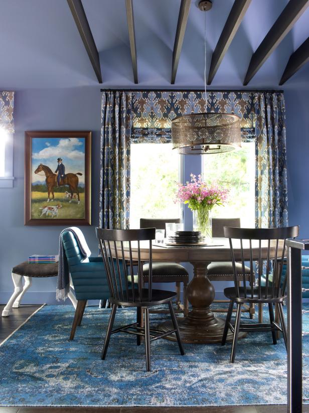
Use this irresistible periwinkle tone as your foundation shade for a layering of sophisticated blue hues. But this time, take it all the way to the ceiling, wrapping your entire room in this soothing and mesmerizing color. Here, the harmonious mix of blues works to unify the space and blend the whimsical fusion of design styles.
Bold & Beautiful
“Displaying a carefree confidence and a daring curiosity that animates our creative spirit, inquisitive and intriguing PANTONE 17-3938 Very Peri helps us to embrace this altered landscape of possibilities, opening us up to a new vision as we rewrite our lives,” say the Pantone color experts. “Rekindling gratitude for some of the qualities that blue represents complemented by a new perspective that resonates today, PANTONE 17-3938 Very Peri places the future ahead in a new light.”
So, start dreaming now and infuse a bit of this delicious hue into your lake home spaces. The palette possibilities are virtually limitless, with an endless array of color combinations. From all of us at Lake Homes Lifestyles—may your 2022 be filled with joyful color!